OVERVIEW
Canada is a safe haven for many refugees, with the recent war in the Middle East, Canada is on a mission to provide a new home to many refugees. We understood that leaving home and settling in a new country is rough, even worse for refugees. So we wanted to help all refugees in Canada settle in comfortably. My team and I created Transition, an app and website that lets refugees find resources and services conveniently, help find community events, and translate and chat using a chatbot.
MY ROLE
DURATION
TOOLS


MY CONTRIBUTION
I was one of the two product designers in the team. Throughout the project, I was heavily involved in all aspects of the design to understand our users and design better. Some methods my role took part in were user research, user interviews, empathy mapping, persona creation, IA, user journey, user flow design, UI design, UX design, and principle IxD.
PROCESS

CHALLENGE
CONTEXT
During preliminary research, we found out that the Canadian government is accepting one million refugees and immigrants to Canada over the next few years (2019, 2020, 2021). The Canadian government has already accepted 310,000 new permanent residents to Canada in 2018 and we saw this as an opportunity to design a niche solution; this provided a business backing as the Canadian government is interested in helping other organizations that are aligned with their motives of helping newcomers comfortably relocate to Canada.
2019 - 2021 Immigration Level Plan


DISCOVERY
As a team, we brainstormed to understand who our users are... we asked questions like what are their main needs? what threats do they face? How does immigration Canada treat them? What is their journey like to call refuge in Canada? If they have a family, what is their perspective of the journey?
BRAINSTORM
To understand what's already out there in the market we brainstormed about the competitors who are helping refugees. We found out that the Canadian government (Asylum Program) and the United Nations Refugee Agency are the main entity that helps refugees with the support of sponsors and volunteers. Rather than competing with the government, we designed our business model to assist them by finding what is lacking in their service and improving the user experience when finding information and communication.

EMPATHY MAP
As a team, we created an empathy map to feel and get into the perspective of what a refugee's life is. We used the qualitative data we gathered from the user interviews to assist us when making the empathy map. The empathy map helped us design the persona and the user journey later on in the design process.

USER INTERVIEWS
To understand and empathise the user better we went to them. We hosted 3 user interviews and each interview took around 30 minute. During these interviews, we first asked permission to record for future reference and followed up by asking about their journey to Canada. While interviewing we asked follow up questions to get better overall understanding of the situation they are in.
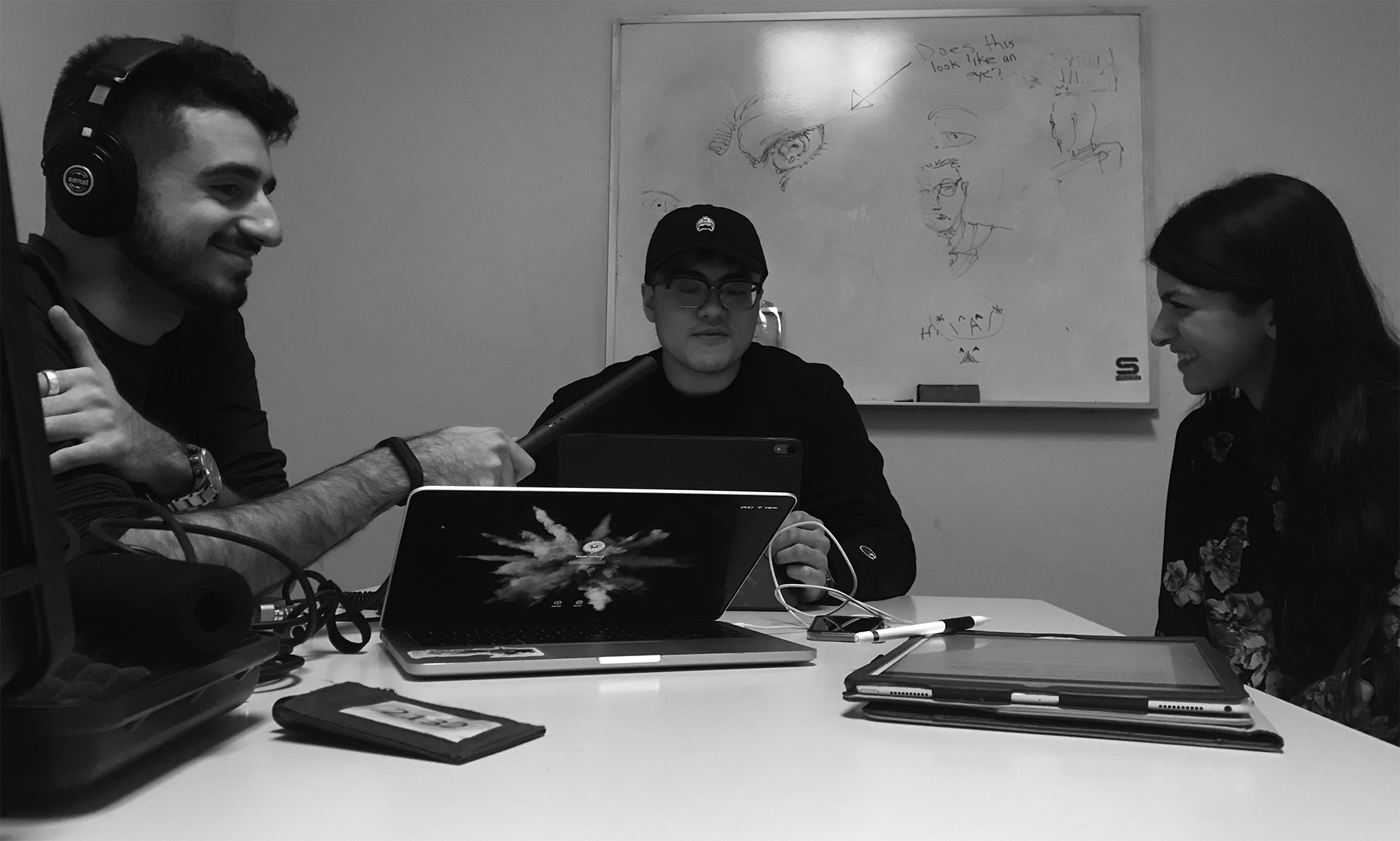
USER INTERVIEWS QUESTIONS
- What was your journey to Canada?
- What methods did you use to apply to come to Canada?
- How did you find a place to live?
- Did you seek help from the In-Canada asylum program?
- How did you find your first job?
- Did you take ESL classes? If ‘yes’ how did you find the class?
- What were your main needs when you came to Canada?
- Are you involved in your cultural community?
- In your free time did you attend any Canadian events and cultural fest?
CORE USER PROBLEMS
By narrowing down the user problems, to core user problems, we were able to define our minimum viable product (MVP).
- Language barrier
- Culture shock
- Unfamiliar environment
- Finding jobs
PERSONAS
Personas were created to share a common understanding among our team business dev, and designers. We also used personas to guide when we pitched our solution.

JOURNEY TO CANADA

USER JOURNEY

Landing Phase - This is the point where Transition is introduced.
Communication Phase - One of the biggest problems we are trying to solve is the communication barrier as 62% of the refugees barely speaks English well. Ex: Translating and seeking for proper refugee program, communicating health information etc
Reinforcement Phase - Helps the user jump through hurdles easily as all the information that they seek for is conveniently curated in our app/ site. Ex: finding jobs, schools, PR documents etc.
Establishment Phase - Once the Canadian government stops supporting our users we want to ensure that they meet the basic needs and have a living income to support themselves.
Foresight/ Planning Stage - If the user wishes to sponsor their family or start a business, we want to help them achieve it.
TOUCH POINTS
Now that we have a pretty good understanding of our user through empathizing, I looked at places where we could intercept our potential users. I looked at the journey of the refugee to Canada and planned out points where we could introduce transition. Few of the main interception points were...
Airport welcome care package
SponsorEnlisted refugee program
Volunteer mentor
ESL classes
Immigration Canada offices
In these locations, we can either directly introduce Transition, and or increase marketing advertisement to ensure that the solution is been used by the target audience.
INFORMATION ARCHITECHTURE
Before working on the user flow I restudied our research to define the minimum viable product (MVP), this got me out of the ambiguity, giving me the possibility to map out the information architecture. I made two drafts, the first one is an over all over view of the flow, then I went into detail mapping the responses & feedback of every step a user can take.

WIREFRAMES
At the start of wireframing stage, I was very ambiguous and sketched out all the ideas I had. I also went on Dribbble, Behance, and Pinterest to draw inspiration while keeping in mind our target user. To explore as many ideas as possible we did crazy 8's exercise and concept sketched as many wireframes as possible. Then I narrowed it down and selected the interaction we liked. When I selected the final wireframes that were going to be designed, I kept in mind that our users might not be tech-savvy and or speak English as fluent as a North American. So when designing the user interface we kept the tone simple and easy to understand and navigate.

USER INTERFACE Version one


USER TESTING
We test our app multiple times in different stages of fidelity, which gave us usability insights that we have overlooked. Observing the user was the key, as we noted some did not want to be rude by criticizing the app. By observing the users reaction of performing an objective when we asked helped us understand if the app was intuitive or not.
DESIGN SYSTEM

Illustrations


FINAL USER INTERFACE DESIGN
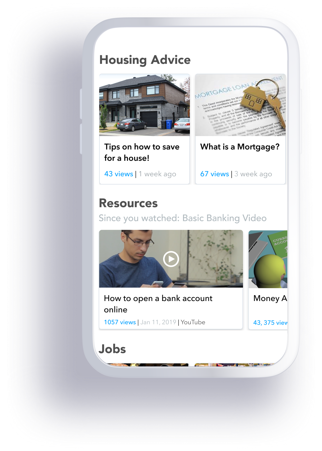
SEARCH PAGE
The purpose of the app must be clear to the user within seconds, that’s why we chose search to be the landing page. The user is given a few options based on the area and most popular. If the user knows what resources they are looking for they can directly type it out in the search field, if they are unsure, they can select the advance search survey to get a search result.
EVENTS
We want all newcomers to feel welcomed to our community, the best way to connect with our community is through free events & festivities that are happening all year round.
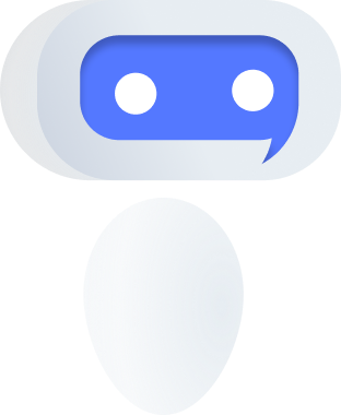
CHATBOT
We understood that users may have a language barrier through our user interviews, so we introduced a voice user interface chatbot that could communicate with a user in their mother tongue. We also added messaging and calling as an option in case the users language option is not available or they want to connect directly with immigration services.


LOG-IN & SIGN-UP
Our main focus was to provide our services as fast as possible, so we thought sign-up process was slowing down the process, therefore, we pushed the sign up process after gaining the user’s trust first.
B2B WEBSITE
Another goal of the app was to share our insights with the government to help improve Canadian immigration. Immigration Canada can access the user info to get a better understanding of where to allocate more resources and services within Canada to serve the newcomers.
.png)
LEARNING OUTCOME
Originally this was my university 4th-year capstone project that has been revamped using some of the research done with my team. I really liked the challenge we chose and wanted to re-do the visual design and interaction design of the app and design the web aspect of the solution which my team and I were unable to do due to running out of project time. If we were to define the MVP of the app at an earlier stage of the design we would have been able to accomplish a lot more as a team, however, we were learning and transferring that knowledge into the design as we designed the original version which slowed us down. A big takeaway from this project is that each UX challenge is different and could be approached in many ways, by having a thorough understanding of what you are solving will definitely help speed up the design process with better results.